
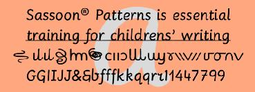
Sassoon Patterns family
Many children start school with their hands not ready and trained to produce the precise strokes required for forming letters and starting to write. Pattern is essential preparation. It is fun for children, building their confidence as well as training their muscles for the task. This package has a normal letters and patterns in a single font, together with a teachers‘ Copybook in PDF format offering progressive exercises by Rosemary Sassoon.

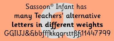
Sassoon Infant family
An upright typeface family developed to meet the demand for letters to produce pupil material for handwriting as well as for reading. Many alternative letters are included in each font. Upright letters with extended ascenders and descenders areideal on screen. They facilitate word recognition. The exit strokes link words together visually, and in handwriting they lead to spontaneous joins along the baseline leading logically to a joined-up hand. Teachers can print desk strips, charts of letter families and alphabet friezes, as well as consistent material across the curriculum. Together these typefaces provide a valuable resource for special needs teachers. In the complete Infant ‘Starter’ package, a FREE copybook in PDF format is included for teaching progressive letter groups and worksheets following principles of Rosemary Sassoon.

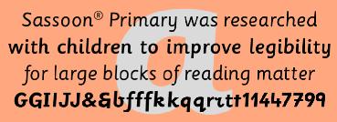
Sassoon Primary family
The Regular typeface was researched with children, for children and developed specially for use in children's reading books. Many other uses have been found for these legible and friendly letters. Many alternative letters are included in each font.
Modern typefaces have shortened ascenders and descenders to help fit as much text as possible into a page, but words lose their shape. This may not trouble literate adults but it is quite a different matter for children struggling to read. These friendly characters were the result of asking young children what kind of letters they found easiest to read - and then including features like extended the ascenders and descenders. The slight slant makes blocks of text easier to read.

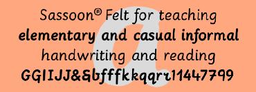
Sassoon Felt family
An educators alternative to Comic Sans (from Microsoft) and Chalkboard (from Apple), which are appropriate for ‘Print’ style writing in United States Elementary schools and may also be appropriate for parts of Australia. These features usually include crucifix t, diagonal y downstroke, short f, two-stroke and there may be more.
Sassoon Fe|t's more casual letterforms can be used either as informal text or for the teaching of reading and handwriting; having the letterforms most taught in UK schools.

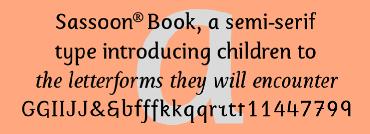
Sassoon Book family
Semi-Serif Roman and Italic for typefaces for setting legible children's reading books.
A gentle introduction for young readers to seriffed letterforms they will encounter.

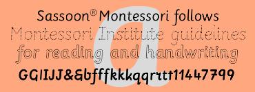
Sassoon Montessori family
Typefaces following Montessori Institute guidelines for reading and handwriting.
With these fonts, the crucial stages of letter formation are made easier for parents and teachers to produce consistent worksheets. Children should then progress towards an efficient and mature joined-up handwriting.

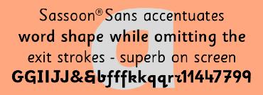
Sassoon Sans family
A more mature font retaining the clarity of the Sassoon typefaces that accentuate word shape, while omitting the exit strokes. A more legible alternative to standard Sans serif typefaces - superb on the screen. Many alternative letters are included in each font. A typeface designed with the computer screen in mind. It retains maximum legibility even in the most unusual layout - ideal for multi media uses and giving unimagined clarity to menus and navigational aids. Avoid eyestrain with a typeface that accentuates word shape as well as the identity of individual letters.
Legible in print at tiny point sizes so ideal for captions. Ideal for older pupils, perhaps at Secondary school, or adults, who no longer require ‘exit strokes‘ to clump the letters together.

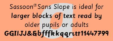
Sassoon Sans Slope family
An elegant sloping sans serif typeface with generous ascenders and descenders,retaining legibility down to small sizes. The slight slant makes it ideal for larger blocks of text. Legible letterforms for the computer age. Many alternative letters are included in each font. A new concept in Sans Serif typefaces. The clear, friendly letterforms and extended ascenders and descenders that together promote fast word recognition, designed originally for Sassoon Primary are now modified to suit adult users. Slightly sloping letterforms make the reading of blocks of print easier. Ideal for older pupils, perhaps at Seconday school, or adults, who no longer require ‘exit strokes‘ to clump the letters together.

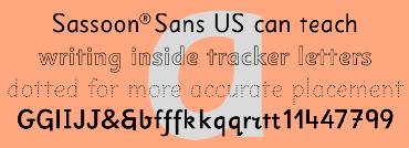
Sassoon Sans family US Set
North American version for teaching children's first letterforms, with dots and arrows. A more legible alternative to standard Sans serif typefaces - superb on the screen. Many alternative letters are included in each font. A typeface designed with the computer screen in mind. It retains maximum legibility even in the most unusual layout - ideal for multi media uses and giving unimagined clarity to menus and navigational aids. Avoid eyestrain with a typeface that accentuates word shape as well as the identity of individual letters.

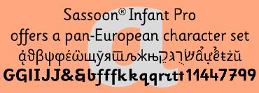
Sassoon Infant Pro family
Regular and Bold tyepfaces covering pan-European languages: 9 Latin, 6 Cyrillic, Greek, Turkish, 13 Baltic, 8 Rusyn, 6 Nordic, Vietnamese. Upright typefaces developed to meet demand for letters that can be used to produce pupil material for reading as well as handwriting.

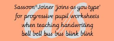
Sassoon Joiner family - English Set
Designed for teaching children, these ‘join-as-you-type‘ fonts are for use with applications compatible with OpenType fonts. Enables progressive pupil exercises for a smooth transition between separate letters and teaching joined handwriting. In this complete package, a FREE cursive copybook in PDF format is included for teaching joined letterforms and worksheets following principles of Rosemary Sassoon.

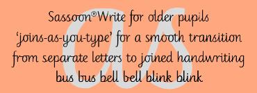
Sassoon Write family - English Set
Designed for older pupils and adults. A family of 4 ‘join-as-you-type‘ fonts, or use them unjoined. For use with OpenType compatible applications. Enables progressive pupil exercises for a smooth transition between separate letters and teaching joined handwriting.

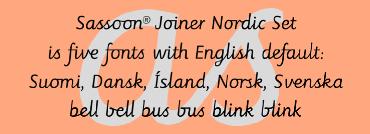
Sassoon Joiner family - Nordic Set
This package contains the typeface ‘Sassoon Joined‘ in a Regular weight only, for the 5 Nordic languages; Finnish (Suomi), Danish (Dansk), Icelandic (Island), Norwegian (Norsk), Swedish (Svenska), with English as the default language in all fonts.

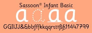
Sassoon Infant Basic School reading/writing pack
These four fonts provide the basic requirements for teaching both reading and pre-cursive handwriting;
Sassoon Infant Dotted B for handwriting beginners to 'track' over letters.
Sassoon Infant Line for handwriters to 'copy' what they see on the line.
Sassoon Infant Regular for short passages of text/large displays to aid handwriting.
Sassoon Primary Regular for large passages or whole books of typeset reading material.
For a complete pre-cursive handwritng solution with heavier weights, outlined (tracker) and dotted variations (for handwriting practice) see the ‘Infant Starter‘ pack which also has a FREE teachers’ copybook included.

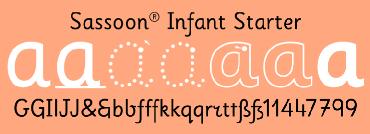
Sassoon Infant Starter School writing pack
We call this selection of fonts ’Starter' because we believe every European teacher should begin teaching with these children's first handwriting letterforms; 7 fonts include solid fonts, outlines, dots and arrows.
An upright typeface family developed to meet the demand for letters to produce pupil material for handwriting as well as for reading. Many alternative letters are included in each font. Upright letters with extended ascenders and descenders are ideal on screen. They facilitate word recognition. The exit strokes link words together visually, and in handwriting they lead to spontaneous joins along the baseline leading logically to a joined-up hand. Teachers can print desk strips, charts of letter families and alphabet friezes, as well as consistent material across the curriculum. Together these typefaces provide a valuable resource for special needs teachers. A FREE copybook in PDF format is included for teaching progressive letter groups and worksheets following principles of Rosemary Sassoon.
Tracker B font, with its direction arrows helps pupils to start in the correct place.
Motor movements can be refined by keeping inside the line. When starting and direction is no problem, the arrow can be dropped and the plain Tracker font used.
To refine motor movement, Dotted B, with its direction arrow, again reminds pupils where to start and gives pupils confidence when tracking more closely over the dots.
Larger dots mark the pen down points.
When start points and direction are remembered, Dotted, without the starting arrow can be used.
When start points are remembered, direction remembered and motor movement is sufficiently refined, pupils are ready to write what they see, rather than tracking over the letters. So, the Line (baseline) font can be displayed and underneath, an empty baseline for the words to be copied.
Regular font can be used for text or larger display panels.
The Medium weighted font can be used to emphasis particular letters within a word, or used at smaller sizes to make the letters heavy enough to be legible.

OpenType fonts

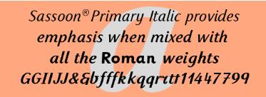
Sassoon Primary Italic family
A simple italic style, specially developed for mixing with any of the Sassoon fonts to provide emphasis. This Italic provides emphasis when used with Roman weights. Sassoon Medium Italic may be used successfully with either Medium or Bold weights. Its greater weight difference when used with Bold creates even more emphasis.